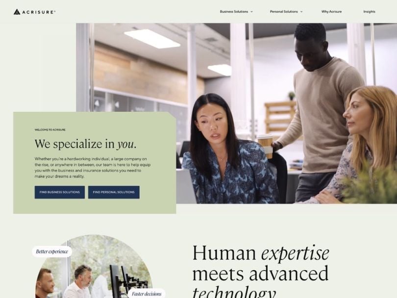
Clients of Acrisure know that they’re likely to find the right insurance and business solutions for their unique needs. But for the team at Acrisure Innovation — a technology-focused section of Acrisure aiming to upgrade the insurance business — the company’s website called for a more streamlined user experience.
EVP of Growth Marketing Michelle Stern explained that the need for a website redesign began as a byproduct of Acrisure’s significant growth.
“Over the past 11 years, we have grown from $38 million to nearly $5 billion in revenue and expanded our team to over 17,000 colleagues across 21 countries,” said Stern.
Acrisure has acquired hundreds of independent agency partners, effectively growing a catalog of insurance and business solutions for customers to access via the company’s online platform as well as through its agencies. With a brand identity centered on using smart technology and human innovation to offer personalized solutions for customers, the Acrisure Innovation team knew they needed a streamlined user experience and a visual update to suit the company’s prominent standing in the marketplace.
In other words, the Acrisure Innovation team was faced with a good kind of problem, but with limited time to execute a solution. Aiming to make meaningful upgrades to the website’s form and function, Stern and her team pulled together a cross-functional group focused on speed, communication and prioritization.
To hear the full story behind the website overhaul, Built In sat down with Stern and dug into the details that led to a successful launch and a recent award from Sitecore for “Best Leadership in an Experience Transformation Category.”
Our new website design simplifies access to business and insurance solutions for both businesses and individuals, making it easier to find the right coverage or expertise.
Across industries, small to midsize businesses can quickly get insurance quotes typically within minutes, while larger businesses can easily connect with advisors to access a comprehensive suite of business and insurance solutions. These business solutions range from risk mitigation to employee benefits, payroll services, cybersecurity and IT services.
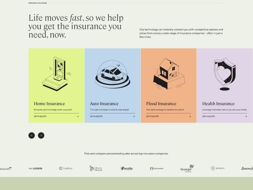
Individuals can also benefit from rapid access to quotes from top insurance companies providing home, flood, auto, life and health insurance coverage, in addition to other solutions such as mortgage origination services (provided by FBC Mortgage, an Acrisure partner).
Working closely with our product design team and external creative partners, we ensured the website was also visually appealing. The user experience is designed to be intuitive and the visual identity reflects our optimistic, welcoming brand tone, offering a fresh, modern look that helps us stand out in a competitive industry.

Why did Acrisure need a website redesign?
A global fintech leader, Acrisure empowers millions of ambitious businesses and individuals with the right insurance and business solutions to help them grow boldly forward. We combine cutting-edge technology with personalized human support, offering access to solutions across insurance, reinsurance, payroll services, employee benefits, cybersecurity, mortgage origination and more.
Our growth was fueled by the acquisition of hundreds of agency partners, each previously operating independently with their own websites. It became clear that consolidating these into a single digital platform was critical to providing a more cohesive and streamlined experience for our clients. This decision sparked the creation of our new brand, which reflects a modern, optimistic and welcoming tone.
By uniting our digital presence under one platform, we promote a more efficient, intuitive experience for clients, while strengthening our global brand identity. Our external creative partners were integral in shaping this new identity. From rethinking the brand voice to redesigning the visual elements, they helped ensure every touchpoint with the website felt seamless and engaging.
“By uniting our digital presence under one platform, we promote a more efficient, intuitive experience for clients, while strengthening our global brand identity.”
The new website encapsulates this refreshed brand, where businesses and individuals can connect to the right insurance and business solutions at the right price and time while interacting with a design that conveys trust, professionalism and warmth.
What role did you play in developing and launching the website? What tools or technologies did your team use to build it?
The website was a large cross-functional initiative involving teams from areas such as marketing, sales, product, product design, engineering and legal. My team led the strategy behind the redesign, managing everything from the design, content creation and timeline development to site tagging for analytics. Our design partners translated the brand book into something visually compelling, creating a user experience that was both beautiful and functional. The imagery, layout and navigation were all strategically crafted to guide users through the site intuitively, while also reflecting the welcoming, innovative nature of our brand.
In terms of technology, we utilized our content management software alongside our proprietary technology that enables businesses and individuals to receive quotes from top insurance companies. Additionally, the back-end tech stack includes tools like our customer relationship management system, ensuring smooth operations and an optimized user experience.

What obstacles did you encounter along the way? How did you keep team members motivated and aligned throughout the product development process?
As with any launch, we encountered a variety of challenges, including trying to satisfy a wide range of stakeholders across a large, global company. We were also working under a particularly aggressive timeline, and certain tasks took longer than anticipated, which added to the complexity. We’ve gained valuable insights from the process and have applied them to improve our approach moving forward.
“We’ve gained valuable insights from the process and have applied them to improve our approach moving forward.”
To keep everyone aligned, we maintained constant communication with clear priorities and well-defined tasks. Just as important was fostering a culture where team members felt comfortable raising concerns if they saw risks that could impact timelines. This open communication allowed us to problem-solve creatively and collaboratively to find the best solutions. Our product design team and creative partners were vital to finding unique solutions, often having to make quick adjustments to keep our visual identity consistent while meeting the technical challenges we encountered.
With so much cross-functional collaboration, what strategies did you employ to ensure everything went smoothly?
There were at least a couple dozen key collaborators across the product, sales, product design, engineering and legal teams. We had regular meetings to discuss progress, challenges and action items to meet our timeline. Working closely with the product design team and external creative partners was especially crucial as the website’s success depended on its functionality and the user experience, tone and overall aesthetic. We used design sprints and collaborative reviews to ensure every team was aligned and that creative decisions enhanced the technical performance of the site.

When you think of other companies in your industry, how does Acrisure compare when it comes to how you build and launch new products?
Acrisure is a company of problem-solving entrepreneurs. Each of the hundreds of agencies under the Acrisure umbrella was built by entrepreneurs, so it’s in our culture to operate with agility. We’re also highly innovative. In fact, the marketing team for Acrisure resides under the “Innovation Team,” which is a small group within Acrisure. This group also includes product and technology experts who implemented the website strategy in partnership with external creative partners.
“Acrisure is a company of problem-solving entrepreneurs.”
We place a strong emphasis on top-tier creative talent and collaboration to deliver not only a user-friendly experience but also a visually stunning aesthetic. Our external partners have played a pivotal role, contributing fresh and visionary ideas that have been key to shaping our brand identity and crafting a seamless, engaging user experience. As we grow our in-house creative team, we’ll continue pushing creative boundaries, evolving our visual storytelling and driving our brand forward.


