By Daniel Rohsler, Account Manager
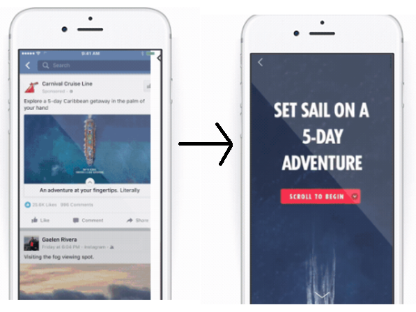
Canvas ads are a mobile-only Facebook ad unit that appear in a user’s News Feed the same way a static link or video ad does. Upon click, the ad expands to full screen immediately - the ads are pre-loaded when they appear in News Feed to avoid lagged load times when clicked, which is advantageous over linking directly to your website or microsite where there will be a slight delay as Facebook brings the user off-site. Canvas is also great way to improve conversions from mobile - especially if your brand’s website doesn’t have a great user experience on mobile.

Canvas ads aren’t a new ad type, but many brands still haven’t taken advantage of them. Or, if they are using Canvas, they aren’t tapping into the unit’s full potential. It seems like brands often get stuck on how to align the composition of their ad with their goals and objectives. Naturally, you’ll want a Canvas supporting your awareness and equity-based campaigns to provide a different user experience than one supporting direct-response efforts.
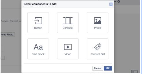
The following components can work in tandem to create an engaging experience for your audience:

Photos - There’s no limitation on how much text can be overlaid on images, which means there’s no 20% text rule that we see on standard ads. Vertical/portrait is the recommended orientation, but widescreen images can be uploaded too and can take advantage of the ‘tilt to pan’ feature that allows a user to tilt their phone and reveal more of the photo.
Videos - You can use multiple, but they can’t exceed two minutes of total video time. Vertical/portrait is the recommended orientation, but widescreen videos can be used as well.
Carousels - Image sizes can vary, either taking up the whole screen or a portion of it. Up to 10 photos can be included in the carousel.
Buttons - 30 characters max, with adjustable fonts and colors.
Text Blocks - A 500 character max with adjustable font size & color.
Product Sets - These link directly from your existing product catalog.
When structuring your components, alternate between them to make the user experience most impactful. For awareness-based campaigns, build your Canvas ad with lots of video and text-heavy imagery to provide context. For DR, leverage the button and product set functionalities. When appropriate, use a combination of both - just make sure that it is easy for the user to understand the end goal.
Is your brand taking advantage of Canvas? Let us know!


